


Bandz N’ Showz
Streamling the Show
Promotion Process
Musicians and Promoters Have Trouble Driving Fan Turnout to Shows...
When trying to log tour dates users (musicians, managers, etc…) have trouble keeping track of all the sites they need to post tour dates to and often have to redundantly
re-post information on many sites. We would like to explore ways to streamline the process by saving users time and frustration by developing a new platform.
Our Process


This case study is very involved click on the icons below
if you want to jump to any specific sections.

This Section //
Research
What we tackled:
-
Competitive Analysis
-
Heuristic Analysis
-
Research Plan
-
Screening
-
Interviews
There was a major disconnect between
where fans are and bands list!
Most of the places where regular folks here about show are not the sites listed above by more common places like social media and ticketing sites.
1. Competitive Analysis // Research
The best place
to start was a Google search
We searched:
“Sites for local bands to list shows”
And this is what we got. Some of these we had never heard of before which was surprising since I play and a band... and am more dialing into this than most folks.

Where Our Fans Are

Other Notible Sites

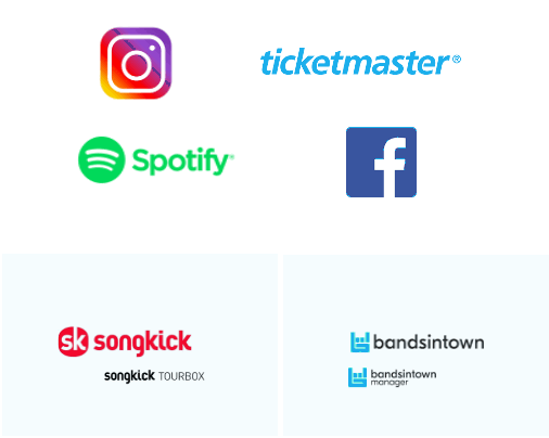
This is where
fans are listening.
There are about four big players in the musician/tour manager space. They don’t work great with each other.
-
You can’t list direct on Spotify
and have to use Songkick Tourbox.
-
BandsInTown can push to Facebook.
But Facebook has its own event page!
-
Lack of control with Ticketmaster
-
No Proper event listing on Instagram
-
There are many players in the musician / tour manager space. They don’t work with each other.
-
Some of them push out to social or to other platforms.
-
Songkick being the player really trying in this space.
-
They have even been working with Google. BandsInTown and Songkick work with Wix a website platformsome bands may use.
-
The fans are in a different space from the apps bands are using to manage tour dates. AKA you want to reach fans on Facebook and Twitter but need to update tour dates on your website with Songkick.
-
The venues mostly control big player listings like Ticketmaster, etc…
-
Venues list tour dates with ticket links on their sites bands do not have to tackle this side of the listing
2. Heuristic Analysis // Research
Our Heuristic
Journey Begins
The three sites below are websites that bands and managers use to currently track and book their gigs. We wanted to do a dive into the below to see what was working and what could be improved as we moved into design our platform.


Songkick allows you to organize and track your favorite bands, get concert alerts, and buy tickets. Get instant tour dates from your music library.
Find tour dates and live music events for all your favorite bands and artists in your city. Get concert tickets, news and RSVP to shows with Bandsintown.
Find upcoming events near you, with listings, tour dates and tickets for concerts, festivals, movies, performing arts, family events, sports and more.
*Sadly Eventful is not longer up and running. It is now something called radio.com. COVID has taken a big toll on live event spaces.
We focused on these three aspects of Heuristic analysis when review the sties.
Overall Scores (1-10)
1-3 Not acceptable
4-6 Passable
7-9 Meeting Customers Need Well
Link to the full research
presentation here:
https://drive.google.com/file/d/1CjONuUwkaKODUc3hDLGjzYPqbqUo74Tb/view

User control
and freedom
Users often choose system functions by mistake and will need a clearly marked "emergency exit" to leave the unwanted state without having to go through an extended dialogue. Support undo and redo.
Match between system
and the real world
The system should speak the users' language, with words, phrases and concepts familiar to the user, rather than system-oriented terms. Follow real-world conventions, making information appear in a natural and logical order.
Help and
documentation
Even though it is better if the system can be used without documentation, it may be necessary to provide help and documentation. Any such information should be easy to search, focused on the user's task, list concrete steps to be carried out, and not be too large.
Songkick
✓ Venues Pre Populate
saving time and effort
✓ Artists Pre Populate
to save time
✓ You can manage
multiple artists
✓ The event form is very easy
to edit, update, delete and use overall.
✓ Has some good integration
to push out to other platforms
I am targeting.
✓ Overall the site design was simple nothing really jumped
out at me.
✓ This site is specifically for bands listing show dates.
✘ The ticketing language/
userflow could be clarified/simplified to allow
for better understanding.
✘ The help section is very
poorly designed and
needs work.
Bandsintown
✓ You can manage
multiple artists
✓ Venues Pre Populate
Saving Time
✘ Overall the “add event” form
was really unresponsive at times and really buggy.
✘ It was not clear how to easily delete or edit.
✘ Artists Pre Populate – Saving Time BUT this is very buggy does not always work ☹
✓ This site is specifically for
bands listing show dates.
✓ The site design was nice but
the event form design could be way better!
✘ Might have some site integration as well. Does
provide a share link but
that is very limited.
✓ The chatbot help is way better than the actual help part of the site and was super responsive!! Awesome Help! Chatbot for the win!
Eventful
✓ It was easy to make an event but then I had to go through extra steps to find it then track it so I could edit or delete it.
✓ Venues Pre Populate – Saving Time
✘ Not really a lot of integration to other sites.
✓ This site is for making events in general.
✘ Overall the design was clunky and corporate. Not very cool or fun.
✘ I could not find a way to follow my bands they did not show up in search.
✘ That part of the site not working well.
✘ The help is terrible. There was no help button at the top. You can only email and I had to really search for it.
3. Research Plan // Research
Our Research
Plan
In order to get off on the right track we needed to have a plan to target the correct potential users for research on our platform.
Here is our plan:
4. Screening // Research
Narrowing
The Field
We solicited 25 users to get insights on who best continue on with in our next round of interviews. Along the way we gained some really useful insights to take into our research.
Our
Screener Results
ProTip: Google Forms takes all the hard work out of visualizing your data so I was able to utilize the charts they create to see my data at a high level quickly.
5. Interviews // Research
What We Heard
We reached out to local musicians and promoters.
Here are some of the questions we wanted to dive deep into.

Our Guiding
Interview
Questions:
-
How many concerts per month do you post about?
-
How many hours per month do you spend on posting tour listings?
-
Talk about the importance of fan turnout?
-
Name your top three ways to spread the word about upcoming concerts?
-
What online services do you use to share you upcoming concert infomation.
-
Do you work on mobile,
desktop or both?
-
Walk me through how
your current process for posting?
-
What do you find easiest?
-
What do you find hardest?
-
What would make things
easier for you?
-
Name your dream experience :)
Interview
Insights
What our
users are saying.
After talking with our potential users this is
what we heard:
-
Users would like to better know what actually works to drive fan turnout with some metrics and data.
-
The big goal is to get fans to turnout and despite posting everywhere fans that want to go are missing the information about concert dates.
-
Users are frustrated by the fact they need to relist events in multiple places.
-
Venues can also create listings
and do not always work with promoters or bands which leads to duplicate listings and/or events.
-
Users would like better integration with the sites and formats they are already using to keep their calendar.
-
Users know most of their fans are on Facebook but it is becoming increasingly hard to reach their fans on the platform.

This Section //
Systhesis
What we tackled:
-
Affinity Mapping
-
Empathy Mapping
-
Our Personas
-
How Might We
-
Solution Idea Brainstorming
-
Our User Stories
1. Affinity Mapping // Synthesis
Mapping
Our Results
We disseminated user interview insights into sub-categories to create an affinity map.
-
Number of shows per month
-
Hours you spend promoting each show
-
Where do you reach fans
-
What devices do you use
-
Who is in charge of posting show listings
-
Ways to make it better
-
Pain Points
-
End Game
Leading With Empathy
Using our insights from the affinity
map we broke out user base out
into three categories for our
empathy map.
-
The Local Rocker
-
The Road Warrior
-
The Promoter
2. Empathy Mapping // Synthesis
Some of the key insights we
wanted to gather were:
-
What they said
-
What they heard
-
Any Pain and Gains
-
What they thought
-
What they see
3. Our Personas // Synthesis
Creating Our
Personas

Who in the rocker are we targeting
Check out our three personas
Primary
Sam Evergreen // The Local Rocker
Secondary
Chet Slick // The Promoter
Joan Lightning // The Road Warrior
How
Might We Questions
-
How might we use data to drive fan insights from event listings?
-
How might we connect better with technology (google calendar,
spreadsheets, etc.) bands are currently using?
-
How might we make creating events on mobile easier to use?
-
How might we aggregate current listing platforms to post show listings all under one hub?
4. How Might We // Synthesis
-
How might we combine the digital and analog ways of promotion to work together better (word of mouth, postcards, flyers, social, etc.)?
-
How might we create event listings that fans do not miss or forget about?
-
How might we minimize the amount of time it takes to create and post listing to relevant sites?
5. Solution Video // Synthesis
Our Design
Evolution
The Ideation Process
I wanted to film my ideation process so I set up a custom camera rig to track it so you could see top down what I was thinking along the way! In this process I went over my how might we questions we stated in the section above and talked through some sketches I was able to brainstorm around them.
We created a number of user stories and ranked which ones to prioritize for our MVP (Minimum Viable Product).
Feel free to check out the PDF to the left.
5. User Stories // Synthesis
Our
Stories

This Section //
Sketch
What we tackled:
-
Sitemap Sketch
-
Red Routes
-
User Flows
-
Paper Sketches
-
Guerrilla Testing
-
Testing Results
-
Our Wireframes
-
Visualizing Our Wireflow
1. Sitemap Sketch // Sketch
Mapping
Our Platform
After we collected all our data we started to make a sitemap based on our user feedback on how to best stream line the process.
After a bunch of rough sketching
our site map ended up looking like this.

Our MVP:
Planning our Red Routes
Bandz N’ Showz is an expansive platform for seamless band promotion.
After some careful consideration, the two most critical functions we need to tackle
before we can address anything else would be:
2. Red Routes // Sketch
User On-Boarding
Can a user create an account, profile, link social accounts and login? Basically, the on-boarding process for new users.

Create a New Show
Can the user create a show, add other bands and bandmates to contribute to the show they created. From there can they use our platform to create a promotional campaign with our social aggregator to push out to their social planforms based on the schedule they set.

Diving Deeper:
User Flow Patters for our Red Routes
In this stage we wanted to layout all the potential options a user would have as they flow through
our two red routes and what would happen at each of these key points in the process.
1. User On-Boarding
2. Create New Show
3. User Flows // Sketch


Turing our flow
into sketches
Once we had our flow in order we took some time to create some rough sketches of our red routes.
Bringing
Our Vision
to Life
4. Paper Sketches // Sketch

The Stay at Home Adjustment
Since we were trapped in “Stay at Home” lockdown
we could not let that stop us!
We found the really rough sketches hard to work with over zoom and wanted our testers to be able to read things clearly so in this step we up'd out sketching game.
We created a low-fi prototype for remote user testing of our sketches from our red route wire flows. Here are the before and after of our low-fi mocks. Since they were just replacing sketches for guerllia testing they are not clickable at this stage.
Before
After
Guerrilla Testing Our Sketches
During COVID Times

5. Guerrilla Testing // Sketch
The Master Plan: I am going to do a series of user tests via zoom online screen share for our Bands n’ Showz platform. I recruited participants online by reaching out to members of the music community who I thought would be a good fit for our test, could proper manage a zoom call and were available during our testing timeframe. Once the participant was confirmed I set up a google hangout/zoom link to complete the test. (This was in a really early days of COVID so not everyone was a zoom expert yet!)
With this I am hoping to flag any pain points early on in the process so we can update the design accordingly.
Here are the two priorities I am looking to get insights into:
1. How would you sign up for an account with Bands N’ Showz if you are a new user? Walk me through the account set-up process.
2. You just locked in a date for a new gig and you are looking to list and promote it out to the masses through Bands N’ Showz. What steps would you take to do so?
Top Findings
6. Guerrilla Testing Results // Sketch


1. On-boarding: There needs to be a way to opt out, have a free option and/or to try before adding credit card information. Users felt like it was a lot up front where they were not invested in entering all information till they tried it out first. Users said if they had to put payment info in up front they would leave. They basically only want to make a username and password then be able to poke around from there on the user dashboard. Also, “The Let’s do it” page is redundant and unnecessary so we should take it out.
2. Show Promo Wiz Page: Our test users had the most confusion and issues with this page. Might reconsider how to design this to connect Press Copy with Press Wiz and Social Copy with Social Scheduler so they work together better as a team. The social scheduler needs more info in the prototype since testers were unclear what that was. Same goes for press. Also need to call out what things are plus up possibly and what are free.
3. Invite Others: Testers were confused about the “Invite others” button. Did it mean invite friends, Did it mean people who are not on social media? Did it mean other Admins? Need to
Additional Reccomendations
-
Under bio and profile picture need to call out it is for the band/venue/ promoter and not your personal bio/profile pic.
-
Drop down menus are not drop down they are auto populate. Change design to reflect so.
-
Want an option to just type in band name not auto populating as plain text. Did not want to have to add a band that is not listed.
-
Same as #2 and #3 for “venue”.
-
Add Event Name option as well as
Tour Name. Two different things...
-
Call out “add additional bands” button more prominently
-
Logo goes to the homepage everywhere not just before you are logged in.
-
Take out the star for new events since it was confusing to testers.
Is there another way to say new?
-
Should there be a home dashboard button somewhere?
7. Our Wireframes // Sketch
Creating
Our First
Prototype
Our Wireframes
We used insights gathered in the last round of guerrilla users testing to enhance our design in the next round of prototyoe creation.
Our Wireflow
Once we worked any adjustments into our red routes based on insights during guerrilla testing we needed to connect the two routes together into a wireflow.
8. Visualizing Our Wireflow // Sketch


This Section //
Design
What we tackled:
-
Moodboard
-
Style Guide
-
Gestalt Principles
-
High Fidelity Mocks
-
Building Our Prototype
1. Moodboard // Design
Setting The Tone

We also used Milanote to create a more comprehensive space to brainstorm our moodboard:
2. Style Guide // Design
Our Style Guide
Here are some top-level design choices we are using to convey our brand vibe throughout our community. We are also leveraging much inspiration from the Material Design Kit. Google Rocks!
You can find the full style guide here:


3. Gestalt Principles // Design
Material
Design Meets
Bandz N' Showz
1. Material Design is overall a pretty-loose set of principles that can be applied at a high level BUT basically the goal is to keep things looking sharp, consistent, clean and responsive from one platform to another.
2. Here is a resource you can use to dive in deeper into Material Design: https://material.io/
3. We also found some components we may use moving forward: https://gallery.io/apps and https://materialdesignkit.com/android-gui/

Our Homepage meets
Google Material Design


1. Moved our important content
up to be above the fold.
2. Added scrolling animation of
user testimonials that will
rotate left to right.
3. Content broken up top to
bottom into containers which
will rollout better on mobile.
Other Modifications / Off Script
Overall added greater explanation to what the product is and highlighted our partnerships. So people checking out the site for the first time understand what we are offering right off the bat :)
Next Steps
Potential to adjust layout once we roll out for mobile down the road for seamless responsive design
Our Dashboard meets
Google Material Design


1. Moved our show list up to be the first thing a user sees and is above the fold.
2. Better overall use of bold colors to separate out sections.
3. Added in a side navigation specific to users logged into dashboard.
4. Increased white space
and overall breathing room.
Other Modifications / Off Script
Stats are a bit more visual and less to the grid we want these to be a bit more arty.
Next Steps
May use Material Design list component during development. What other assets can we use while in dev?
4. High Fidelity Mocks // Design
Form to Function Blending in Design
Improvements with Style
Using our testing insight from our gurilla testing here are some before and image of how we applied our tester feedback into our high fidelity mocks up in the next round.
![shutterstock_1722342391-[Converted].jpg](https://static.wixstatic.com/media/4325c1_2d914bbfa8fb4035961c55cceba47d33~mv2.jpg/v1/crop/x_392,y_708,w_4183,h_3617/fill/w_861,h_740,al_c,q_85,usm_0.66_1.00_0.01,enc_avif,quality_auto/shutterstock_1722342391-%5BConverted%5D.jpg)
6. Build Our Prototype // Design
Building Our Working Prototype
Once we had our high fidelity designs created we used InVision to create a high fidelity working prototype for our users to test. Feel free to scroll though the screen below to get a feel for our design.
This computer screen is a working prototype click around on me!
Full screen working prototype
https://projects.invisionapp.com/d/main#/console/20027885/419518131/preview

This Section //
Test
What we tackled:
-
Our Test Plan
-
Round One Testing
-
Round One Results
-
Design Modifications
-
Round Two Testing
1. Our Test Plan // Test
Creating Our
Testing Plan
Before we stared testing our users
we wanted to create a solid game plan.
Explore the PDF on the right
to review the full plan.

2. Round One Testing // Test
Round One Testing Process
We interviewed six people that fit into the app's target demographics as moderated remote testing via zoom.
This was combined with insights from five unmoderated TryMiUi user testers to get an even more in depth look at the platform and how to improve our design.
3. Round One Results // Test
Round One Results
Insights We Are Looking to Gain:
-
Over First Impression - How would a first time user engage with the site what does it do?
-
Is the onboarding flow easy for users to engage with and understand?
-
Are users able to create a new show from scratch?
-
Are users able to set up a promotion plan that is tailored to their needs?
-
Can users add other administrators to their event?
You can review the full results here:
Top Findings
Problem
Solution
“Booking Magic” and “One Free Show” Language is confusing since we currently
do more promotion than booking.
-
Change home page language
from “Booking” to “Promotion”.
-
Maybe add a booking side to
the platform (down the road).
-
Explain “One Free Show” better say something like “Promote One Show Per Month”.
Sign In page should include language
for new users to create an account
-
Add a create new account link to the sign in/login landing page (this is standard on most sites).
-
Make clickable area in prototype larger
(it tripped some folks up)
All users wanted
the free option.
-
We changed the question we asked to assume they had budget. We are testing the paid option at this point, so it did not make sense to get caught up on the free option. Assume most users will most likely try the free option first but we are testing billing.
Progress bar during onboarding to keep
users engaged and/or make the skip
button more prominent.
-
Add progress bar to onboarding
-
Add profile status to home page
to get users to add to profile
-
Make the skip to dashboard button
more prominent.
4. Design Modifications // Test
Our Key Adjustments

Before

After
Home Page
1. Changed Language to be more clear about product offering.
Our service focuses more on Promotion/Fan Turnout and is not a booking platform (AKA Sonicbids).
"One Stop for Booking Magic" is now "One Stop for Gig Promo Magic".

Before

After
Pricing
1. Added Progress Bar
2. Reinforced promotion feature language.
3. Made Sure to keep the free option since we assume most users will try this first.

Before

After
Login
1. Added a call to action for new users. A lot of new folks went straight to this page in testing so we want to make sure there was an option for them to create a new accoutn here.

Before

After
Connect Accounts
1. Added Progress Bar
2. Included a "skip for now" option to opt out of this section and go directly to the dashboard. Some users wanted to test things out before they commited the time to connecting all their accounts.

Before

After
Dashboard
1. Added profile strength icon to encourage users to fully complete their profile.
2. Highlighted the Create Show option since that is our key feature.
3. Improved the way we display shows to include a call out to any shows you just added up top, then list upcoming shows by date order.
4. Changed language from "Show Invites" which people found confusing to "Pending gig requests". Also added a notation to draw attention to the pending gig requests using an new mail type of icon.

Before

After

Promo Wix
1. Broke on page into two pages. Users for there was too much going on here and it was confusing.
2. Added enhanced admin feature and clarity. Users can now see who they asked to be an admin on their show. We used Facebook as inspiration since most folks are familiar with that concept.
3. Made the show promo page more expansive with more options as to which connected accounts you are using when.
4. Included some plus up paid features on this page, with a better explination for the offering.
Updated Working Prototype
Full screen working prototype
https://projects.invisionapp.com/share/D4XHDNBWSVX#/screens
5. Round Two Testing Results // Test
Round Two Tesing Results
In this round we revisited some of the insights and changes we gathered in round one. We then did 6 moderated tests via zoom. Five of the users were new users and one was a return user.
Once we had a chance to really dive in with our testers we were able to address some confusion and pain points. We also found some other areas which would enhance our user experience moving forward in Round 2.
You can review the full results here:
Top Findings
Problem
Solution
How do I set which day I want something to post? AKA: like Tues but Tues June 12th and Not 16th?
-
Add a calendar day option to show promo scheduler.
-
Add a save button to the right where it updates what promoyou have going on thus far.
How do I make each post custom
without paying for someone to do it.
-
Add a text field for each new promo they want to create. This would allow them to set the text they want for each one if they so choose.
Is there a Automated count down?
-
Set up a best practice automated standard option that works. Such as: One Month Out, Two Weeks Out, Like One Week Out, Day Before, Day Of...
Admin page needs to be reworked a bit.
Overall expand flexibility and preferences.
-
Show whether or not they are a member on Admin when you enter email.
Like if they are a BNS user already…
-
Make this form auto populate if it is a user on the platform or someone you have connected with in the past.
-
Once you enter the email you are going to send you can specify what preferences there are. Check out Google doc for an example.
-
Make “x” just say pending
-
Add a marker for “owner” so you know
who is the event creator.
Show finish screens
-
Overall show finish screens in the next
round of prototypes if possible.
-
Make my profile clickable in the side nav.
Make this on all dashboard screens
-
Make Chatbot/Help Icon clicky with pop-up window.
-
Tighten prototype overall and make additional spots clickable where users have been tripped up.

This Section //
Results
What we tackled:
- Next Steps
- Recap
1. Next Steps // Results
Our Next Steps
Look into Hootsuite and HubSpot:
Might gain some good insights from those platforms.
Iterate on Prototype:
Continue to iterate on next round of prototype to address user concerns for the Admin page and some additional options from promo along with any small house keeping changes.
A/B test:
Do an A/B test for when the billing order should be placed during onboarding.
Case Study:
Build a really awesome case study from what we have so far.
Present with Confidence:
Present this a ladies that UX Lightning Talks in the future to get additional feedback on this presentation.
Find Funding:
Could I actually build this thing? Would people pay me to do this figure out how I would go about doing that…